Elementary Theory of Demand — Economics STD 10 — Question
ICSE BoardEnglish MediumSTD 10EconomicsElementary Theory of Demand2 Marks
Question
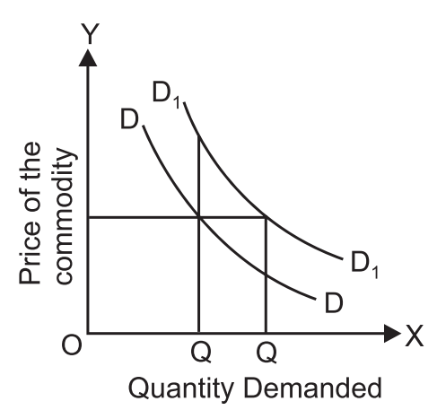
Explain the following diagram.
✓
Answer
In the diagram, the demand curve shifts to the right from DD to $D_1 D_1$. It shows the situation of increase in demand. A larger quantity $\left(O Q_1\right)$ instead of $O Q_0$ is demanded at the same price of OP. Same quantity $OQ _0$ is demanded at a higher price of $OP _1$
Need a full question paper?
Generate a complete, print-ready paper with questions like this in minutes — across 16+ boards, with answer keys.