Question
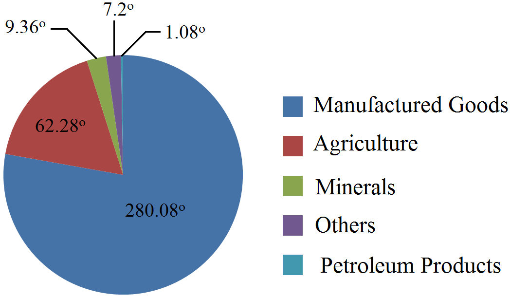
Percentage distribution of export of India is given below. Construct a pie diagram using this data.
Commodity Group
Export (in %)
Agriculture
17.3
Minerals
2.6
Manufactured goods
77.8
Petroleum products
0.3
Others
2.0
Total
100

Answer

For constructing a pie diagram, it is necessary to convert the percentage into angles of different degree. This conversion is shown below:
Commodity Group Export (in %) Degree of Angles
Agriculture 17.3 $\frac{17.3}{100}\times360^\circ=62.28^\circ$
Minerals 2.6 $\frac{2.6}{100}\times360^\circ=9.36^\circ$
Manufactured goods 77.8 $\frac{77.8}{100}\times360^\circ=280.08^\circ$
Petroleum products 0.3 $\frac{0.3}{100}\times360^\circ=1.08^\circ$
Others 2.0 $\frac{2.0}{100}\times360^\circ=7.2^\circ$
Total 100 $360^\circ$
A pie diagram showing percentage of exports of given data is shown below:

Need a full question paper?

Generate a complete, print-ready paper with questions like this in minutes — across 16+ boards, with answer keys.

Start Generating Free

Similar questions

What do you understand by consumer's equilibrium? Give logical reasoning as to how he reaches his state of equilibrium.
Explain the following:
(i) 'Free entry and exit' feature of perfect competition.
(ii) 'Perfect knowledge' feature of perfect competition.
Suppose an economy produces only two goods, namely wheat and cloth, with its available resources. Following table shows different possibilities of production of wheat and cloth. Calculate the marginal opportunity cost of cloth at various combinations. Also, draw the production possibility curve.
Cloth (Thousand bales)01234
Wheat (Lakh tonnes)1009070400
What do you understand by price elasticity of demand? How is it measured? Explain.
At the given price of a commodity, there is excess supply. What changes will establish the equilibrium price? Explain with the help of a diagram.
Calculate the weighted average of price relative index for 2016 on the basis of 2012 from the following data:
Commodity W $P_0$ $P_1$
2012 2016
A
10
15
20
B
8
10
12
C
6
5
8
D
6
10
13
E
4
4
5
Draw a Lorenz curve with the help of following data.
Weekly Wages (in ₹) Number of Workers
Factory (A) Factory (B)
6 6 2
25 11 38
60 13 52
84 14 28
105 15 38
150 17 26
170 10 12
400 14 4
From the following data, calculate coefficient of correlation between age and playing habits.
Age Group
20-30
30-40
40-50
50-60
60-70
Number of Students
25
60
40
20
20
Number of Regular Players
10
30
12
2
1
Explain different ways of classifying data.
Calculate the median of the following frequency distribution.
Class Interval
Frequency
10-20
4
20-40
10
40-70
26
70-120
8
120-200
2