Questions

4 Marks Questions

🎯

Test yourself on this topic

19 questions · timed · auto-graded

Question 14 Marks
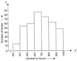
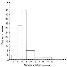
100 surnames were randomly picked up from a local telephone directory and a frequency distribution of the number of letters in the English alphabets in the surnames was found as follows :

Number of letters

Number of surnames

1-4

6

4-6

30

6-8

44

8-12

16

12-20

4

  1. Draw a histogram to depict the given information.
  2. Write the class interval in which the maximum number of surnames lie.
Answer
  1.  

    Number of letters

    Number of surnames

    Width of the class

    Length of the rectangle

    1-4

    6

    3

    $\frac{6}{3}$ $\times$ 2 = 4

    4-6

    30

    2

    $\frac{30}{2}$ $\times$ 2 = 30

    6-8

    44

    2

    $\frac{44}{2}$ $\times$ 2 = 44

    8-12

    16

    4

    $\frac{16}{4}$ $\times$ 2 = 8

    12-20

    4

    8

    $\frac{4}{8}$ $\times$ 2 = 1

  2. The class interval in which the maximum number of surnames lie is 6-8.

View full question & answer
Question 24 Marks
A random survey of the number of children of various age groups playing in a park was found as follows

Age (in years) Number of children
1-2 5
2-3 3
3-5 6
5-7 12
7-10 9
10-15 10
15-17 4

Draw a histogram to represent the data above.

Answer
Here, the widths of the rectangles are varying. So, we need to make certain modifications in the lengths of the rectangles, so that the areas are became proportional to the frequencies.
The minimum class size is 1.
Length of rectangle (Adjusted frequency) = $\frac{\text { Minimum class size }}{\text { Class size of this class }}$ $\times$ Frequency
Then modified table of given data is shown below

Age (in years) Number of children (Frequency) Width of the class Length of the rectangle
1-2 5 1 $\frac{1}{1}$ $\times$ 5 = 5
2-3 3 1 $\frac{1}{1}$ $\times$ 3 = 3
3-5 6 2 $\frac{1}{2}$ $\times$ 6 = 3
5-7 12 2 $\frac{1}{2}$ $\times$ 12 = 6
7-10 9 3 $\frac{1}{3}$ $\times$ 9 = 3
10-15 10 5 $\frac{1}{5}$ $\times$ 10 = 2
15-17 4 2 $\frac{1}{2}$ $\times$ 4 = 2

So, the histogram with varying width is given below

View full question & answer
Question 34 Marks
The runs scored by two teams A and B on the first 60 balls in a cricket match are given below :

Number of balls Team A Team B
1-6 2 5
7-12 1 6
13-18 8 2
19-24 9 10
25-30 4 5
31-36 5 6
37-42 6 3
43-48 10 4
49-54 6 8
55-60 2 10

Represent the data of both the teams on the same graph by frequency polygons.
[Hint: First make the class intervals continuous.]

Answer

Number of balls

Class-Marks

Team A

Team B

0.5-6.5

3.5

2

5

6.5-12.5

9.5

1

6

12.5-18.5

15.5

8

2

18.5-24.5

21.5

9

10

24.5-30.5

27.5

4

5

30.5-36.5

33.5

5

6

36.5-42.5

39.5

6

3

42.5-48.5

45.5

10

4

48.5-54.5

51.5

6

8

54.5-60.5

57.5

2

10

View full question & answer
Question 44 Marks
The following table gives the distribution of students of two sections according to the marks obtained by them:

Section A Section B
Marks Frequency Marks Frequency
0-10 3 0-10 5
10-20 9 10-20 19
20-30 17 20-30 15
30-40 12 30-40 10
40-50 9 40-50 1

Represent the marks of the students of both the sections on the same graph by frequency polygons.

Answer
For section A

Classes

Class-Marks

Frequency

0-10

5

3

10-20

15

9

20-30

25

17

30-40

35

12

40-50

45

9


For section B

Classes

Class-Marks

Frequency

0-10

5

5

10-20

15

19

20-30

25

15

30-40

35

10

40-50

45

1

View full question & answer
Question 54 Marks
The following table gives the life times of 400 neon lamps :

Life time(in hours)

Number of lamps

300-400

14

400-500

56

500-600

60

600-700

86

700-800

74

800-900

62

900-1000

48

  1. Represent the given information with the help of a histogram.
  2. How many lamps have a life time of more than 700 hours?
Answer
  1. 74 + 62 + 48 = 184 lamps have a life time of more than 700 hours.
View full question & answer
Question 64 Marks
The length of 40 leaves of a plant are measured correct to one millimetre, and the obtained data is represented in the following table :
Length (in mm) Number of leaves
118-126 3
127-135 5
136-144 9
145-153 12
154-162 5
163-171 4
172-180 2
  1. Draw a histogram to represent the given data. [Hint: First make the class intervals continous]
  2. Is there any other suitable graphical representation for the same data?
  3. Is it correct to conclude that the maximum number of leaves are 153 mm long? Why?
Answer
  1. Modified continuous Distribution

    Length (in mm)

    Number of leaves

    117.5-126.5

    3

    126.5-135.5

    5

    135.5-144.5

    9

    144.5-153.5

    12

    153.5-162.5

    5

    162.5-171.5

    4

    171.5-180.5

    2

  2. Frequency Polygon.

  3. No because the maximum number of leaves have their lengths lying in the interval 145-153.

View full question & answer
Question 74 Marks
Given below are the seats won by different political parties in the polling outcome of a state assembly elections:

Political party

A

B

C

D

E

F

Seats won

75

55

37

29

10

37

  1. Draw a bar graph to represent the polling results.
  2. Which political party won the maximum number of seats?
Answer
  1. Political party A won the maximum number of seats.
View full question & answer
Question 84 Marks
The following data on the number of girls (to the nearest ten) per thousand boys in different sections of the society is given below :

Section

Number of girls per thousand boys

Scheduled caste

940

scheduled tribe

970

Non SC/ST

920

Backward districts

950

Non-backward districts

920

Rural

930

Urban

910

  1. Represent the information above by a bar graph.
  2. In the classroom discuss what conclusion can be arrived at from the graph.
Answer
  1. The two conclusions we can arrive at from the graph are as follows:
  2. The numbers of girls to the nearest ten per thousand boys is maximum in Scheduled Tribe section of the society and minimum in Urban section of the society.
  3. The number of girls to the nearest ten per thousand boys is the same for 'Non SC/ST' and 'Non-backward Districts' sections of the society.
View full question & answer
Question 94 Marks
A survey conducted by an organisation for the cause of illness and death among the women between the ages 15-44 (in years) worldwide, found the following figures (in %) :

S.No.

Causes

Female fatality rate (%)

1

Reproductive health conditions

31.8

2

Neuropsychiatric conditions

25.4

3

Injuries

12.4

4

Cardiovascular conditions

4.3

5

Respiratory conditions

4.1

6

Other causes

22.0

  1. Represent the information given above graphically.
  2. Which condition is the major cause of women's ill health and death worldwide?
  3. Try to find out, with the help of your teacher, any two factors which play a major role in the cause in (ii) above being the major cause.
Answer
  1. Reproductive health conditions is the major cause of women's ill health and death worldwide.
  2. Lack of proper diet, lack of advised exercises.
View full question & answer
Question 104 Marks
In a city, the weekly observations made in a study on the cost of living index are given in the following table:

Cost of living index Number of weeks
140 - 150 5
150 - 160 10
160 - 170 20
170 - 180 9
180 - 190 6
190 - 200 2
Total 52

Draw a frequency polygon for the data above (without constructing a histogram)

View full question & answer
Question 114 Marks
Consider the marks, out of 100, obtained by 51 students of a class in a test, given in Table.

Marks Number of students
0 - 10 5
10 - 20 10
20 - 30 4
30 - 40 6
40 - 50 7
50 - 60 3
60 - 70 2
70 - 80 2
80 - 90 3
90 - 100 9
Total 51

Draw a frequency polygon corresponding to this frequency distribution table.

Answer
The OABCDEFGHIJKL is the frequency polygon, which is shown in Fig.

Frequency polygons can also be drawn independently without drawing histograms. For this, we require the mid-points of the class-intervals used in the data. These mid-points of the class-intervals are called class-marks.
View full question & answer
Question 124 Marks
A teacher wanted to analyse the performance of two sections of students in a mathematics test of 100 marks. Looking at their performances, she found that a few students got under 20 marks and a few got 70 marks or above. So she decided to group them into intervals of varying sizes as follows: 0 - 20, 20 - 30, . . ., 60 - 70, 70 - 100. Then she formed the following table:

Marks Number of students
0 - 20 7
20 - 30 10
30 - 40 10
40 - 50 20
50 - 60 20
60 - 70 15
70 - above 8
Total 90

Draw a histogram for this table?

Answer
The histrogram is given below.

View full question & answer
Question 134 Marks
A family with a monthly income of ₹ 20,000 had planned the following expenditures per month under various heads:

Heads Expenditure (in thousand rupees)
Grocery 4
Rent 5
Education of children 5
Medicine 5
Fuel 2
Entertainment 1
Miscellaneous 1

Draw a bar graph for the data above.

Answer
We draw the bar graph of this data in the following steps. Note that the unit in the second column is thousand rupees. So, ‘4’ against ‘grocery’ means ₹4000.
  1. We represent the Heads (variable) on the horizontal axis choosing any scale, since the width of the bar is not important. But for clarity, we take equal widths for all bars and maintain equal gaps in between. Let one Head be represented by one unit.
  2. We represent the expenditure (value) on the vertical axis. Since the maximum expenditure is ₹5000, we can choose the scale as 1 unit = ₹1000.
  3. The bar graph is drawn in Fig.
  4. Here, you can easily visualise the relative characteristics of the data at a glance, e.g., the expenditure on education is more than double that of medical expenses. Therefore, in some ways it serves as a better representation of data than the tabular form.
View full question & answer
Question 144 Marks
he following data given the weight (in grams) of 30 oranges picked from a basket: 106, 107, 76, 109, 187, 95, 125, 92, 70, 139, 128, 100, 88, 84, 99, 113, 204, 141, 136, 123, 90, 115, 110, 97, 90, 107, 75, 80, Frequency distribution table:
Class IntervalTally marksFrequency
60 - 80
|||
3
80 - 100
|||| ||||
10
100 - 120
|||| ||||
9
120 - 140
||||
5
140 - 160
|
1
160 - 180
-
0
180 - 200
|
1
200 - 220
|
1
Total
30
30
questions:
  1. Class Size of given class data:
  2. Classmark of forth class:
  3. The number of oranges, whose weight is more than 180g:
  4. The number of oranges, whose weight is less than 100g:
Answer
(i) 20
(ii) 130
(iii) 2
(iv) 13
View full question & answer
Question 154 Marks
In an effort to provide high-quality and safe playgrounds for kids, our reputable manufacturers adhere to the playground safety guidelines set forth by the Indian Consumer Product Safety Commission (CPSC) and the Indian Society for Advancement of Materials and Processing Engineering (ISAMPE). These organizations set the guidelines for determining the types of playground equipment that is appropriate for kids within specific age groups: 2-3 years, 3-5 years, 5-7 years, 7-10 years, 10-15 years, and 15-17 years. A random survey of the number of children of various age groups playing in a park was found as follows: 
Age (in years)Number of children
1-25
2-33
3-56
5-712
7-109
10-1510
15-174
The histogram is as given below:
  1. In this question, the class sizes are different. So, calculate the adjusted frequency for each class by using the following formula:
    Frequency density or adjusted frequency for class:
  2. In this question the minimum class size is:
  3. The class limits of third class interval 3-5:
  4. Adjusted Frequency for class interval 5-7 and 7-10:
Answer
(i) $\frac{\text { Minimum class size }}{\text { Class size of this class }} \times$ Its Frequency
(ii) 1
(iii) Lower limit = 3, upper limit = 5
(iv) 6, 3
View full question & answer
Question 164 Marks
In a healthcare survey by the state government of Maharashtra to study the malnutritional problems in children, 1000 families with 2 children were selected randomly from a town and the following data were recorded:


If a family is chosen at random.
  1. The probability that is no boy:
  2. The probability that it has one boy:
  3. The probability that it has 2 boys:
  4. The probability that it has at least one boy:
Answer
(i) $\frac{6}{25}$
(ii) $\frac{14}{25}$
(iii) $\frac{1}{5}$
(iv) $\frac{14}{25}$
View full question & answer
Question 174 Marks
A teacher is a person whose professional activity involves planning, organizing, and conducting group activities to develop students’ knowledge, skills, and attitudes as stipulated by educational programs. Teachers may work with students as a whole class, in small groups or one-to-one, inside or outside regular classrooms. In this indicator, teachers are compared by their average age and work experience measured in years. For the same in 2015, the following distribution of ages (in years) of primary school teachers in a district was collected to evaluate the teacher on the above-mentioned criterion.

questions:
  1. Write the lower limit of the first-class interval:
  2. Determine the class limits of the fourth class interval:
  3. Find the class mark of class 45-50:
  4. Determine the class size:
Answer
(i) 15
(ii) 30-35
(iii) 47.5
(iv) 5
View full question & answer
Question 184 Marks
A recent survey by a labour organization of the state government of Odisha found that the wages of workers in a factory for different age groups are distributed as given in the bar graph. Read the bar graph
carefully and answer the questions that follow.

 If a person is selected at random, find the probability that the person is.
  1. 40 years or more:
  2. Under 40 years:
  3. Having age from 30 to 39 years:
  4. Under 60 but above 39 years:
Answer
(i) 0.675
(ii) 0.325
(iii) 0.135
(iv) 0.66
View full question & answer
Question 194 Marks
A healthcare survey was done by the state health and family welfare care board of the state of Punjab. The data is collected by forming age groups; i.e; 10-15, 20-25 .... and so on. The overall data from a town is given below in the form of a bar graph.

Read the data carefully and answer the questions that follow.
  1. What is the percentage of the youngest age-group persons over those in the oldest age group?
  2. What is the total population of the town?
  3. How many persons are more in the age-group 10-15 than in the age group 30-35?
  4. What is the age-group of exactly 1200 persons living in the town?
Answer
(i) 446.67%
(ii) 6700
(iii) 300
(iv) 20-25
View full question & answer
4 Marks Questions - Maths STD 9 Questions - Vidyadip