Which one of the following is not the graphical representation of statistical data?
- ABar graph
- BHistogram
- CFrequency polygon
- ✓Cumulative frequency distribution
Answer: D.
View full solution →76 questions across 6 question groups — pick any mix to generate a Maths paper with step-by-step answer keys.
M.C.Q
23 Q→02Assertion (A) & Reason (B) MCQ
5 Q→033 Marks Question
10 Q→044 Marks Questions
22 Q→05Case study (4 Marks)
4 Q→065 Marks Questions
12 Q→One sample from each question group in this chapter. Select any group above to see the full set with answer keys.
Answer: D.
View full solution →Answer: B.
View full solution →Answer: B.
View full solution →Answer: C.
View full solution →Answer: B.
View full solution →Answer: C.
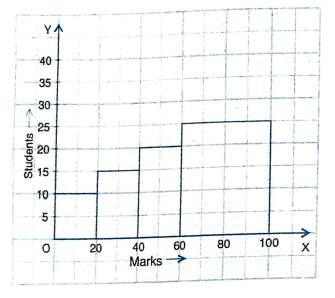
View full solution →| Marks: | 0 - 20 | 20 - 40 | 40 - 60 | 60 - 100 |
| Number of students: | 10 | 15 | 20 | 25 |
Answer: C.
View full solution →Answer: C.
View full solution →Answer: D.
View full solution →Answer: B.
View full solution →| Profits per shop: | 0-50 | 50-100 | 100-150 | 150-200 | 200-250 | 250-300 |
| No. of shops: | 12 | 18 | 27 | 20 | 17 | 6 |
| Expenditure (in ₹): | 100-150 | 150-200 | 200-250 | 250-300 | 300-350 | 350-400 | 400-450 | 450-500 |
| No. of manual workers: | 25 | 40 | 33 | 28 | 30 | 22 | 16 | 8 |
| Height (in cm): | 124 to 128 | 128 to 132 | 132 to 136 | 136 to 140 | 140 tom 144 | 144 to 148 | 148 to 152 | 152 to 156 | 156 to 160 | 160 to 164 |
| No. of children: | 5 | 8 | 17 | 24 | 16 | 12 | 6 | 4 | 3 | 1 |
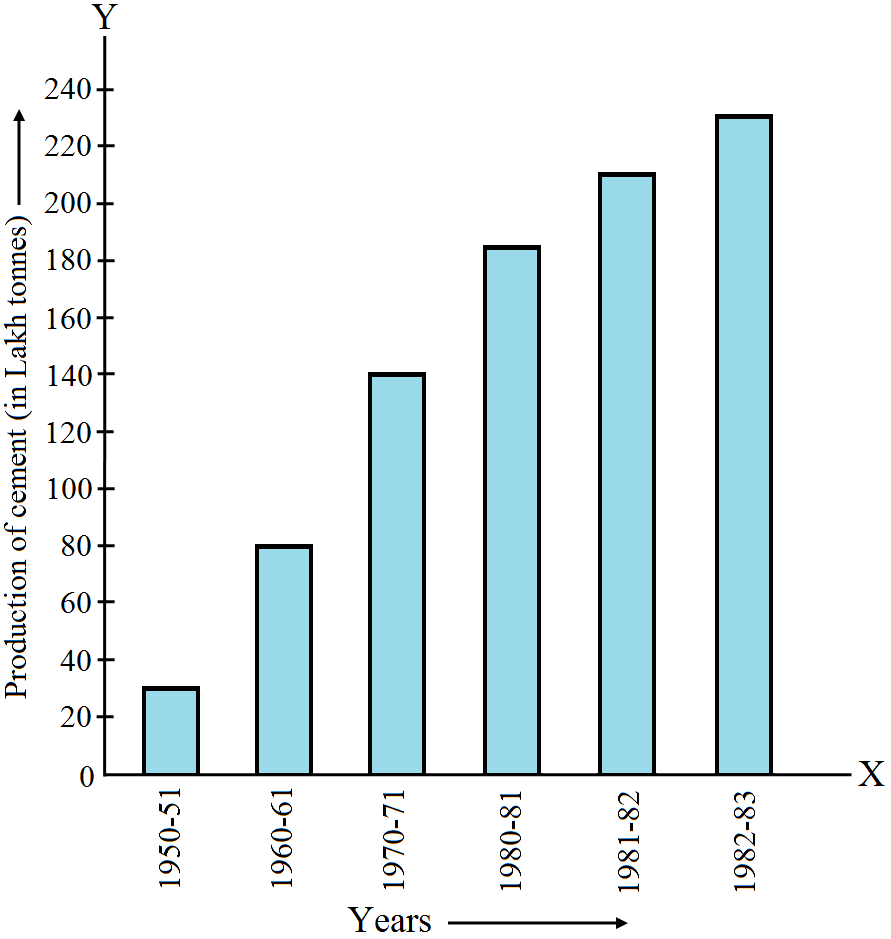
The area under sugarcane crop in the year 1982–83 is three times that of the year 1950–51.
| Plant | Bhilai | Durgapur | Rourkela | Bokaro |
| Production (in thousands) | 160 | 80 | 200 | 150 |
| Refinery | Barauni | Koyali | Mathura | Mumbai | Florida |
| Production of oil (in lakh tonnes) | 30 | 70 | 40 | 45 | 25 |
| Years | 1995–96 | 1996–97 | 1997–98 | 1998–99 | 1999–2000 |
| Income (Rs. In thousands) | 100 | 140 | 150 | 170 | 210 |
| Expenditure (Rs. in thousands) | 80 | 130 | 145 | 160 | 190 |
| Dealer | saya | Bagga links | D.D Motors | Bhasin Motors | Competent |
| Cars sold | 60 | 40 | 20 | 15 | 10 |
| Census year | 1961 | 1971 | 1981 | 1991 | 2001 |
| Population in Lakhs | 30 | 55 | 70 | 110 | 150 |
| Sectors | Investment (in ten crores of rupess) |
| Central government securities | 45 |
| State government securities | 11 |
| Securities guaranteed by the government | 23 |
| Private sectors | 18 |
| Socially oriented sectors (plan) | 46 |
| Socially oriented sectors (Non–plan) | 11 |
| Year | 1950–51 | 1960–61 | 1965–66 | 1970–71 | 1980–81 | 1982–83 |
| Quantity of goods (in crore tonnes) | 9 | 16 | 20 | 20 | 22 | 26 |
| Years | 1982–83 | 1983–84 | 1984–85 | 1985–86 | 1986–87 |
| Value of exports of cotton textiles (in crores of rupees) | 300 | 325 | 475 | 450 | 550 |
| Qualifications | MCA (Masters in Computer Applications) | DCA (Diploma in Computer Applications | DCE (Diploma in Computer Engineering) | CL (Certificate Level Course) | ST (Short Term Course) |
| Personnel required | 40600 | 181600 | 18600 | 670600 | 1802900 |
Pick question groups from the list above, set marks and difficulty, and export a branded PDF with step-by-step answer keys. First 3 chapters free — no signup.